MICA • TYPEFACE
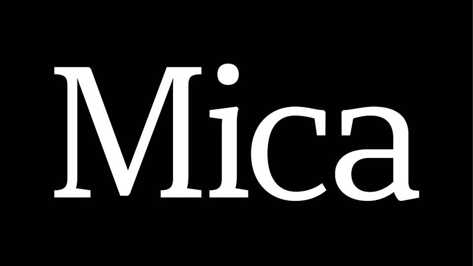
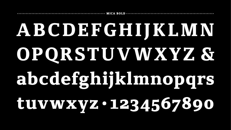
Mica is a text type family developed during my postgraduate studies at Cooper Union as part of the Type@Cooper program. It was designed specifically for short-form editorial use rather than long-form books or novels, with an emphasis on clarity, durability, and performance under less-than-ideal printing conditions.
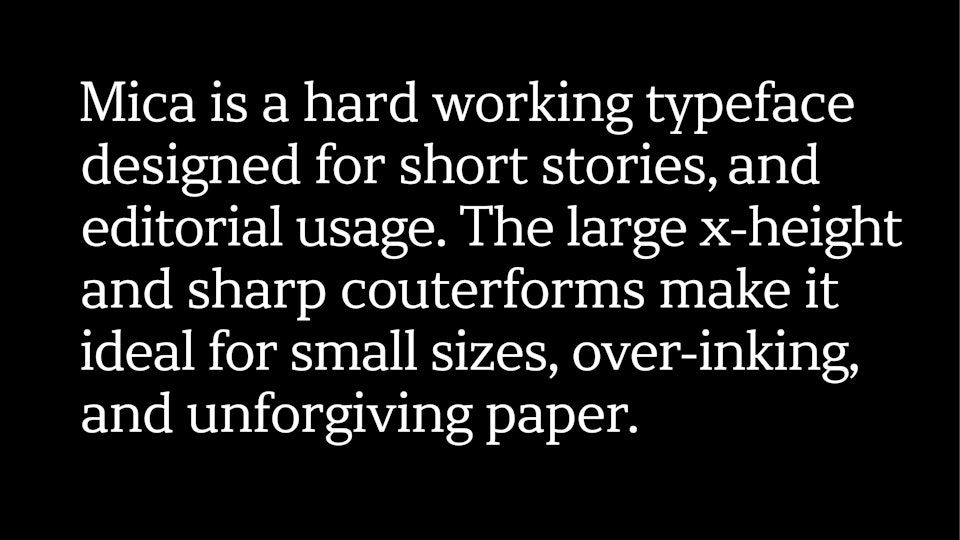
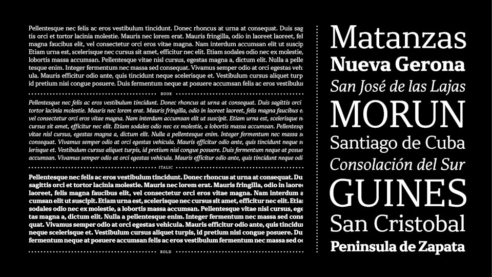
The typeface features a large x-height and sharply defined interior counterforms, optimizing legibility at small sizes and on unforgiving paper stocks prone to over-inking. These structural decisions allow Mica to remain readable and composed in dense editorial environments where consistency matters.
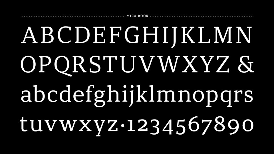
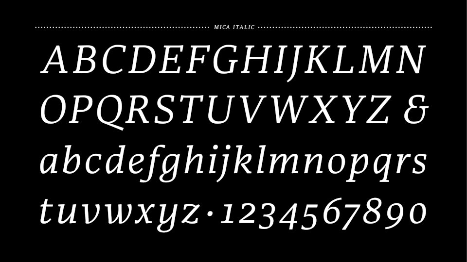
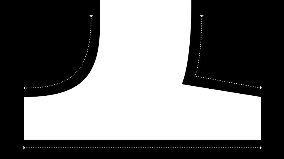
In the Roman styles, select strokes draw from a broad-nib logic, introducing a subtle calligraphic tension that gives the typeface warmth without sacrificing precision. The italics are designed as true companions rather than slanted romans, emphasizing rhythm and forward motion while maintaining editorial restraint.
