DESGIN BRAND CAMPAIGN
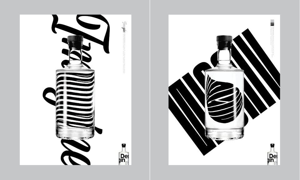
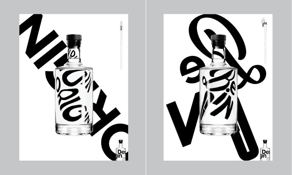
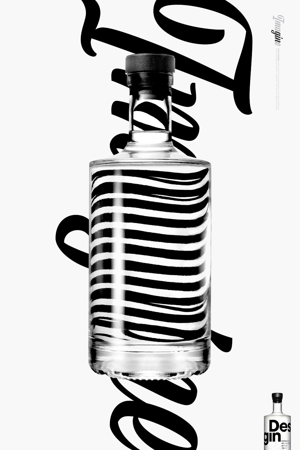
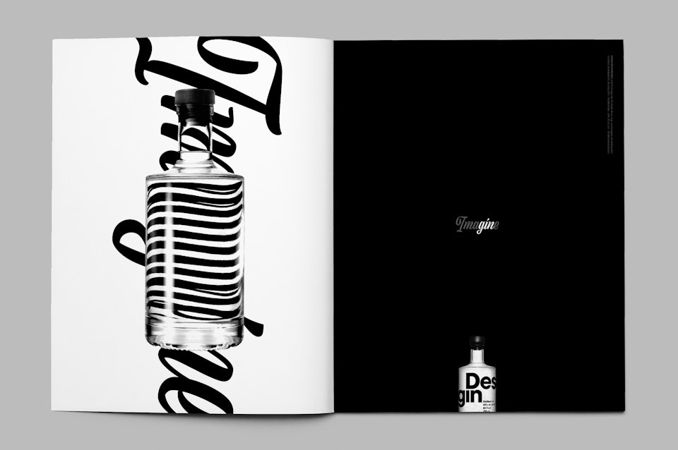
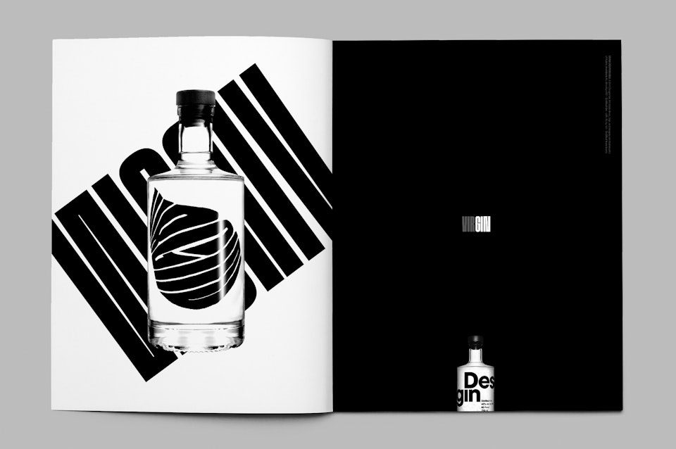
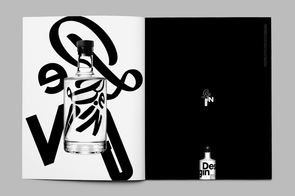
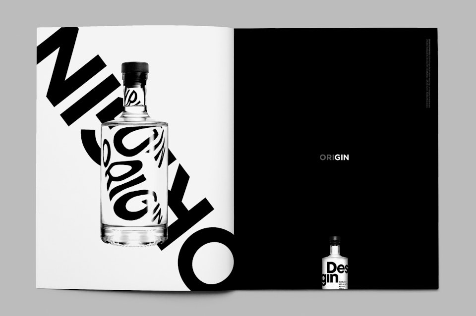
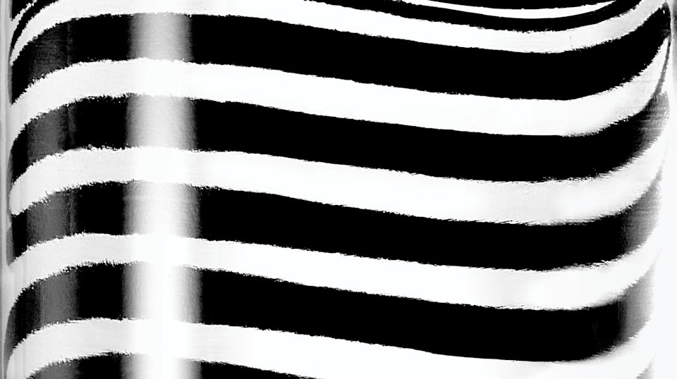
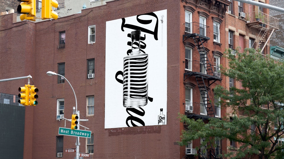
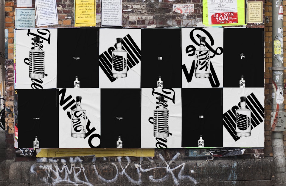
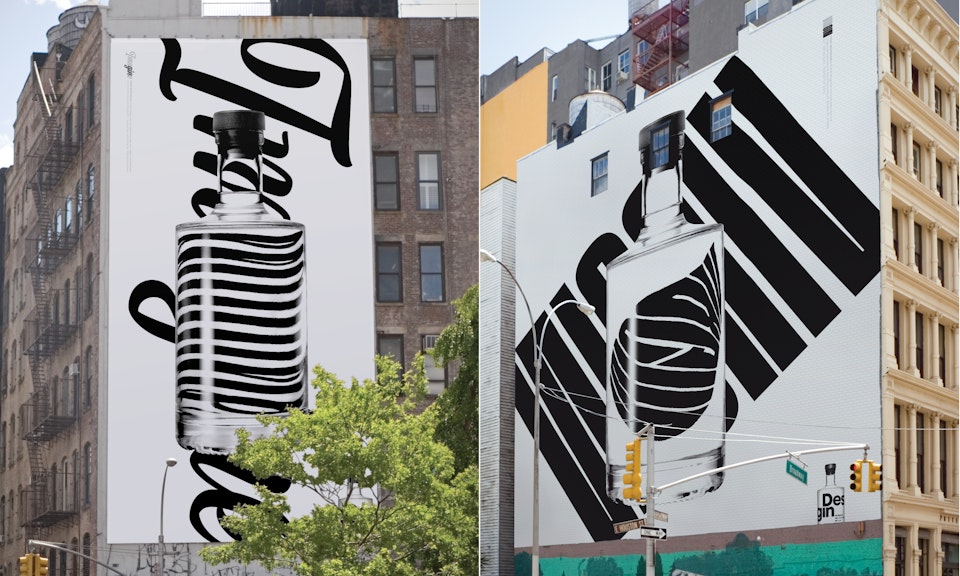
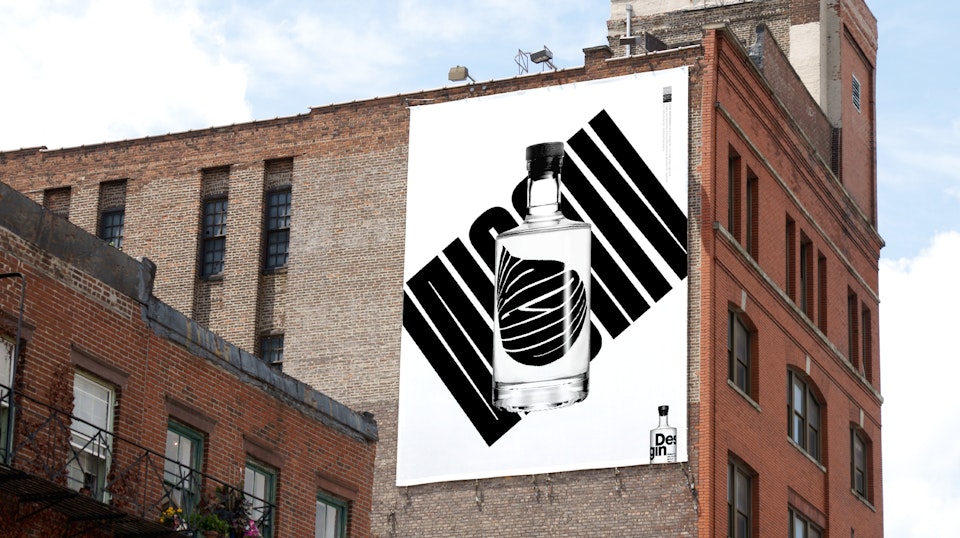
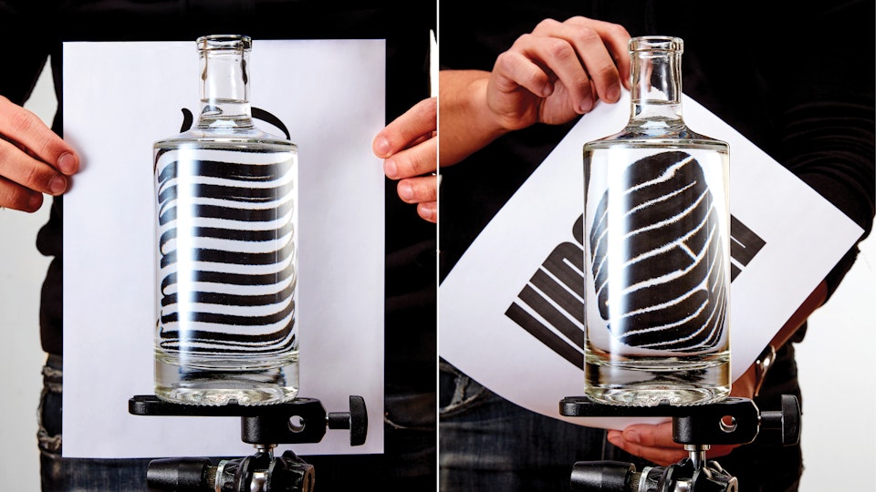
The campaign began with a deliberate act of reduction: removing the label entirely and using the bottle as an optical tool rather than a branded surface. Typography was set behind the bottle and transformed through refraction, with the glass and liquid bending, compressing, and distorting the letterforms. The bottle itself never becomes typography, but instead functions as the instrument that reshapes it.
Each word in the campaign contains the word “GIN,” forming a flexible typographic campaign system built around variation and perception. As the typography passes through the bottle, clarity shifts and distorts, creating moments of tension, movement, and surprise across the compositions.
At its core, the campaign is about visual discovery. Curiosity and experimentation are not just themes but the framework driving the work itself. By inviting viewers to look closer, question what they are seeing, and experience familiar forms in unexpected ways, the campaign mirrors the act of trying the gin for the first time, an invitation to explore, experiment, and engage with the brand through curiosity rather than instruction.
